
Sometimes you get so immersed in creating your site, the contact page gets left out.
Don’t know how to design a decent one? This article will walk you through all stages that make your contact page top-notch.
Create A Form
The very first thing that you have to do when creating a contact page is a form. It’s the core of the page and takes the biggest part of the screen.
Why is it so important? Because if you fail to make an excellent form, you can be losing customers. Even worse, you can be losing business deals.
Here are a few simple steps to increase the performance of your form.
1. Say That A Person Will Read It
Many people are dubious of the contact forms. They believe their email will be read by a robot that will issue an automatic response. Nobody wants that, so many don’t send you the email at all.
Reassure your visitors by a simple phrase like “We read all your emails personally.” Make it even more personal by stating the name of the person who’s reading them. This alone may lead to more letters.

2. Say When To Expect The Answer
Sometimes people have had a bad experience with a form. They’ve mailed it but never got the answer. Now they don’t want to use forms at all.
They will be more willing to reach out and will appreciate your sincerity.
3. Make Sure It’s Working
This one may be rather intuitive, but some people forget to do that. As a result, people can send you an email with a wrong address or a wrong contact number.
This especially is true for the people who think they can do a fancy form with the bits and pieces of PHP they know. It may look pretty, but what a lot of people like that forget is the auto checking feature.
Spend a few extra seconds at the editor to make sure all the necessary data is obligatory to fill in, and the form auto checks its correctness. This will save you a lot of leads.
4. Include Different Pre-Written Topics
If you are running your website for quite a while, you already have a ton of emails on the corporate email. These would typically have common themes.
This can include a sales rep reaching out with an offer, a customer seeking help with the product, or a person asking you details about the product. Add these and all the other typical topics to the form.
Sure, people can write their own topics, but this is way more efficient. You can sort your mail easily with pre-written topics.
5. Make A Thanks Screen
As a result, they will either email you multiple letters or forget about you at all.
Create a simple thank-you screen to tell your customers you have received their email and will reply soon.
6. Pro Tip: Insert Another Call To Action
Sending emails is not everything you can get out of your contact page. To increase its effectiveness, add a call to action to the thank you screen.
It can be the subscription to your newsletter or a social media account. Or it can be a link back to the home page. Or a link to a product you are selling with a discount.
Whatever it may be, placing it there won’t harm. On the contrary, it will increase the engagement time which is good for WordPress SEO. Most importantly, this will help you get more subscribers or sell more goods.
7. Add A Map And Address
Even though the form is the most important element of the contact page, there are others that increase its effectiveness. If you have a physical location or locations that your clients may want to visit, you need a map.
Sure, just writing down your address is good. But having a good web mapping service like Google Maps, OpenStreetMap or an interactive map from Maps Marker Pro is always better. It gives you an edge against your competitors.
Even a screenshot would do, but a multitude of Maps Marker Pro features allow your customers to switch on the navigation and make a route. If they were browsing from their mobile phone, they are probably on the way to your store.
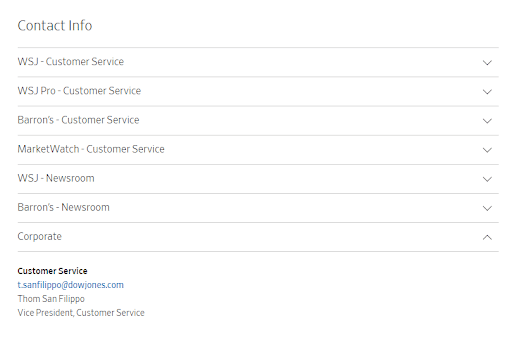
8. Add Your Business Number
Some people just can’t stand using emails. They need to know the answer right here and right now. For these very people, you have to add your mobile number.
It’s easy to forget when you are so concentrated on making the perfect form. But as perfect as it may be, it can’t be a one-size-fits-all solution. Some people would only consider calling you and will leave if they can’t.
What? Your business doesn’t even have a number? It’s high time you got one and posted it.
9. Pro Tip: Tell What Messengers Are You On
Are you working with millennials? Then you’ll definitely need a phone number. No one will be calling, however.
If you decided to bother with a phone number, download a couple of the most popular messengers and provide links to them. At the very least, mention that you have these messengers.
10. Add Your Social Media
Those people who didn’t email you or text you in Whatsapp will want to take a look at your Facebook page. Be sure to check the incoming messages there, as fast responses will make your account look better.
This is also a way of getting new followers. If you are a small business, you probably don’t have much to post about. That’s not a big deal.
Make sure to present your company positively, fill in all the details and post something regularly. It can be once a month or once every two weeks. The point here is to show your page is active.
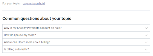
11. FAQ
This will help people get their answers faster, and your team will have the time to answer more important emails.
Making The Best Contact Page
A contact page is a simple but elegant part of your website. It looks like there’s nothing in there, but it’s the small details that make the difference.
Now you know what makes a great contact page. Focus 80% of your attention on the form. Make sure you communicate the right message and create opportunities for different types of emails.
Add a map and other ways of contacting you. Use the thank-you screen to drive more sales.
What is the ultimate advice? Experiment and analyze the results. Be scientific about your website, and it will yield great results.
One thought on “11 Practical Tips For A Helpful Contact Page On WordPress”