Mobile browsing is becoming more and more popular with the advancements in mobile technology. It is extremely important to consider what your website will look like on different devices.
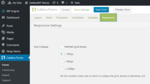
This getting started guide covers the process of adjusting the mobile responsive settings for an existing form. This option allows you to set the smallest screen size at which to collapse your form grid (based on Bootstrap 3). Get more information on the Bootstrap 3 Grid system by visiting their documentation page.
Please note, we strongly recommend leaving the responsive setting as is, to avoid any mobile layout issues with any of your forms.
Configuring Caldera Forms Responsive Settings
Steps To Configure Responsive Settings
Step 1 : Go To The Caldera Forms Admin Page And Create Or Edit A Form
 Starting from the WordPress Dashboard, you can navigate to the Caldera Forms Admin Page by hovering over the Caldera Forms icon and in the drop-down menu clicking on Forms. Create a new form by clicking on New Form in the top Caldera Forms menu bar. Edit an existing form by hovering over 1 form from the list of built forms and clicking on Edit. You are now in the Caldera Forms Layout Builder.
Step 2 : Go To The Responsive Settings Tab
You can navigate to the Responsive Settings tab by clicking on Responsive in the Caldera Forms sub-menu bar.
Step 3 : Configure The Responsive Settings And Save The Form
The different screen width options are the specific “breakpoints” you can set your grid to collapse at. Collapsing a grid essentially means moving from a 2 column grid to a 1 column grid.
Once you select a screen size, click on Save Form.
