Contact forms can be very vital in establishing communication between your company and the rest of the world. Even though there are many other interaction points and forms available on a site, like from a user’s account pages and e-commerce checkout flows, the contact form is a great way for users to contact you directly and start a conversation with you.
Improving the conversion rate of your contact form can make the difference between a successful business and less successful one. An easy to use contact experience shows that you care about your customers.
I thought I’d share some ways to improve the contact form on your WordPress site. These tips should be useful no matter what contact form plugin your are using, but there is one I do recommend.
Keep It Simple

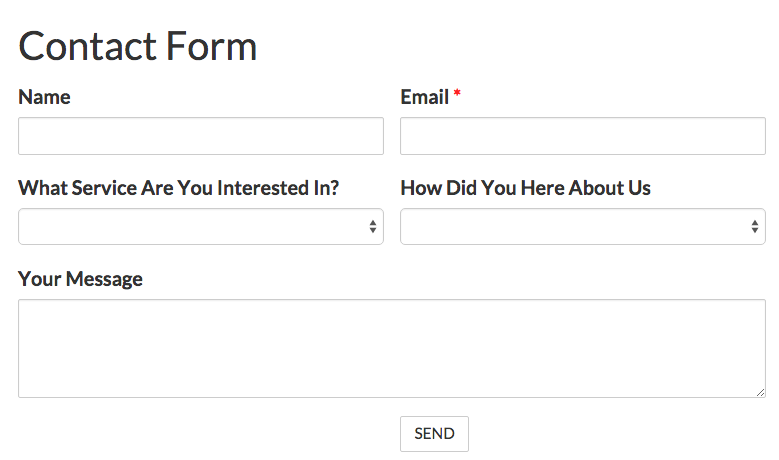
The most important thing to keep in mind, is to remember that the less form fields you have, the greater the conversion. Your contact form should almost, always be simple. Unless you are actively seeking to reduce the number of submissions, keep it simple and leave the important questions you need to ask your leads for later.
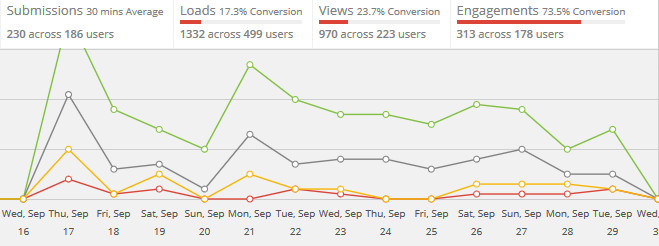
In a research recently conducted by Dan Zarella of HubSpot that analyzed 40,000 contact forms of their customers found out that by reducing contact form fields from four to three forms can increase the conversion rate by almost half.
Make It Easy
The whole point of your contact form is to create a lead. Don’t make it hard for someone who wants to contact your to do so. Eliminate any friction to getting to submit.
Make sure to limit the number of required fields to the absolute minimum. Not everyone wants to share their phone number. If you want to ask for phone numbers in your form, make it optional.
Another important step is to make sure when moving through the form with the tab button, that the fields have a logic sequence.
sequentially when users move through the field. Focus particularly on the final tab for Submit and Cancel buttons. Test your form, and make sure the progression is logical. If you have a cancel or reset button, make sure you will tab to the submit button first. This will avoid accidentally clearing the form data. Even better, don’t use a cancel or reset button if you don’t have to.
Make It Jump Out Off The Page
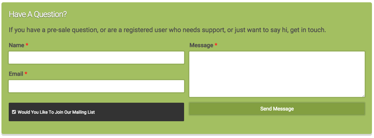
Often times your contact form is at the bottom of the page. If this is avoidable, make it stand out. On our product pages, we have a pre-sales contact form that has a green outline, with a slight drop shadow so it appears to lift out of the page. The drop-shadow is the same as our “Add To Cart” buttons.
It is a simple form, with only a few fields, like I suggested in the previous section, but we (really David) added a list custom CSS in our child theme, targeting that specific form. If a potential customer isn’t ready to click send, then a simple contact form to answer any questions, is a great way to “keep the lead alive.”
Give Them A Reason To Trust You
A contact form is the start of a conversation. Conversations that start with a sense of trust are more likely to end well with you.
That trust starts right on the page that your contact form is on.
It takes a great amount of faith for clients to reach out to you; an unknown business entity from the web. That is why it is important that you assure them that they are connecting with people who are willing to help them with whatever they need.
Establish this by reconsidering information you request on your contact forms. Save sensitive questions for later. Make it clear why you are an expert, and show off any positive reviews or other “social proof” you have.
Also, reassure your customers that their information will not be sold, shared with partners or added to any email list without their permission. Yes, you should incorporate email list sign up to your contact form, but make it consensual.
What Has Worked For You?
I hope you are able to apply this information to improve your contact forms. Be sure to test and experiment as you work to improve your forms.
By no means is this an exhaustive list of everything you can do. If you have any suggestions, I’d love to hear them. Leave a comment, or go to our contact page and fill out the form to contact me.
It’s nice to see the evidence for minimising the number of fields on contact forms all in one place. A lot of our WordPress clients ask for ridiculous numbers of fields on their contact forms, thinking about how this will improve the information they can collect. We always explain how this will impact their conversion rates.