YES or NO: Your website is powered by WordPress.
YES or NO: Your website has amazing, useful, content.
YES or NO: You want everyone to be able to enjoy and utilize both the content and your site.
If you answered YES to all 3 questions, continue reading to learn about the importance of accessibility and how to make your WordPress site a welcoming space for all.
What Is Web Accessibility?
Making the web accessible means designing, coding, and developing in a way that allows people with disabilities to successfully interact with a website. While the process of making a site accessible can be a bit time consuming, the result encourages more people to explore your content and, ultimately, grows and diversifies your audience.
Using Gutenberg To Make Your Content Accessible
If you don’t know by now, Gutenberg is the new WordPress editor. Follow these accessibility guidelines and feel free to use them as a checklist.
Copy
Your copy will likely be the bulk of your content and it’s easy to get carried away, especially when you’re writing about a topic you’re passionate about. It is important to stick to short paragraphs and use bullet point lists whenever possible. People tend to read, interpret, and remember information better when it is presented in chunks (consider how phone numbers are broken up into “chunks of numbers”).
It is also important to be cautious with semantic formatting, mainly when you bold or italicize something. The default markup in WordPress is <strong> for bold and <em> for italics, but these aren’t always correct. <strong> signifies that something is very important (e.g., a warning label), while the alternative, <b> just makes something appear bold but does not change the text’s meaning, so it is best used when you want to highlight a certain point or keyword. Likewise, <em> should be used when italicizing a piece of text to change its meaning, while <i> should be used to emphasize that a piece of text differs from the rest (e.g., foreign words, technical terms, thoughts).
Proper semantic formatting allows screen readers to correctly relay information to those with visual impairments and so it is important, though often overlooked, to do this diligently. In Gutenberg, to edit, simply click on the 3 vertical dots that appear to the right of the block and select “Edit as HTML.”
Next, replace <strong> </strong> with <b> </b> or <em> </em> with <i> </i>, if necessary.
In the example above, the text between the semantic markers is a thought so <i> should be utilized rather than <em>.
After your copy is organized and formatted correctly, make sure to adjust the font and font size. According to the Bureau of Internet Accessibility, the following fonts are fairly accessible:
- Times New Roman
- Verdana
- Arial
- Tahoma
- Helvetica
- Calibri
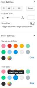
To change the font size, open block settings, then Text Settings. Make sure that the font size is at least a medium before moving in to edit images and videos.
Visuals
This section is about any images, graphics, or videos your content may contain. Images should contain alt text. Adding alt text to describe an image in as much detail as possible allows someone using a screen reader to have a more comprehensive experience with your content. Additionally, alt text actually adds to your content, making it more SEO friendly.
Once you have added alt text and formatted the image, you might want to consider adding image zoom to your site. To allow for image zoom, you can use the Gutenberg Manager plugin to temporarily disable Gutenberg, then use the WP Image Zoom plugin in the Classic Editor to enable image zoom by simply clicking on the image, then on WP Image Zoom’s magnifying lens icon.
Once you click “Save Draft” you will be given the option to either continue editing in the Classic Editor, or continue using Gutenberg.
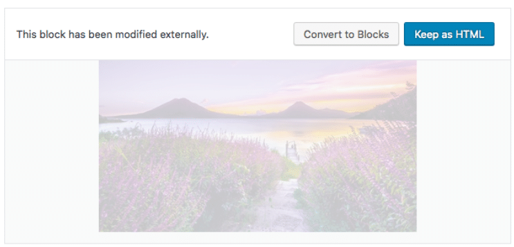
When you return to the Gutenberg editor, your image block will look like this:
For videos, the main consideration is making sure that autoplay is disabled in the block’s Video Settings. Autoplay creates too much sensory clutter when a screen reader is reading text concurrently. Furthermore, unexpected audio coming from a computer tends to establish a generally unpleasant experience for anyone.
Links & Buttons
Your content may contain links and buttons.  Here are the main things you have to keep in mind with these:
- Buttons should contain meaningful text. “Learn More” is not meaningful, instead try “Click Here To Learn More About Accessibility.”
- Anything “clickable” should be large enough to be clicked.
- Links should be distinguishable, consider changing the color or underlining them.
Structural Formatting
Structural formatting refers to the use of proper heading and paragraph tags to indicate hierarchy and content flow. Adjusting these can be done by changing the block type.
Other Considerations
- Unless your copy is very technical, it is advised to aim for a 4th-grade reading level. This ensures that a wider audience can understand your content.
- Try to avoid flashing images. This can be a trigger to those with epilepsy and, much like video autoplay, generally creates an unpleasant experience. Click here to learn more about photosensitivity.
- Checking your color contrast can make a world of a difference for those who are color blind. Color Oracle is great for figuring out color combinations that work well together and WebAIM has a great color contrast checker.
More Resources
- The A11Y Project has checklists and resources for those trying to be more accessibility-friendly
- OzPlayer is a resource for accessible video streaming and is available as a plugin
- Section508.gov will test your site for accessibility
Make Your Website Accessible For Everyone
The new WordPress editor, Gutenberg, is going to be the default editor in WordPress 5.0. Although it will take some time before we’re going to be used to it, please keep these accessibility principles in mind and start making the Internet a friendlier place for everyone.


2 thoughts on “How To Make Your Website Accessible Using Gutenberg”