In this tutorial I’ll be sharing some CSS code to apply the Material Design look to your forms. This look is part of a broader movement in web design that began several years ago, from frameworks to design spec guidelines — so much more than I’m even capable of speaking to in depth — but I think it’s important to at least go over some of the basics that will apply how we are styling our form.
Let’s Talk About Material Design for a Quick Sec
Before we head into the tutorial let’s touch on what exactly Material Design is. What does the term “material design” mean? Well if we look at the official website Material.io explaining what it is it’s a bit easy to get confused. I’m a designer and I find some of the wording just a bit gobbledygook haha! Here’s their nutshell opener:
Material is a metaphor, a system for uniting style, branding, interaction, and motion under a consistent set of principles. With Material we believe product teams can realize their greatest design potential.

What does that translate to for a layman in terms of frontend web design? Based on the visual examples on their site and examples I’ve seen floating around the interwebs for the past couple years, these are some core principles and characteristics that I think make up Material Design:
- Flat / as in surfaces
- Bold / as in color and typography
- Contrast / as in complementary palettes
- Elevation / foreground vs. background via broad box shadows
- Minimal / think less is more
- Shapes / as in basic – circles, squares, etc.
- Animation / for purpose rather than just visual oohs and aahs
Of course there is more to it than that, but hopefully that will help anyone who is completely new to this style.
When I think of the process of achieving the Material Design look I’m reminded of back when I was in college. I had a professor who made us ask ourselves before finalizing any project: what else can you take away and still get the point across? Edit, edit, edit. That to me is the essence of Material Design. Leave what is absolutely necessary and shave off the fluff. Consider small and subtle animations for improved UX over repeated punches of animation overload.
The Guidelines
One of the great things about their official site is that they give a lot of dos and don’ts examples to help guide anyone applying this design style to their form, or any other website element. 
If you’re unsure about color scheme it says in the guidelines “color should be unexpected and vibrant,” which is awesome for those of us who love crazy color palettes! We have a legitimate excuse to bring true cyan into the mix, if we want. 😀
Styling Our Form
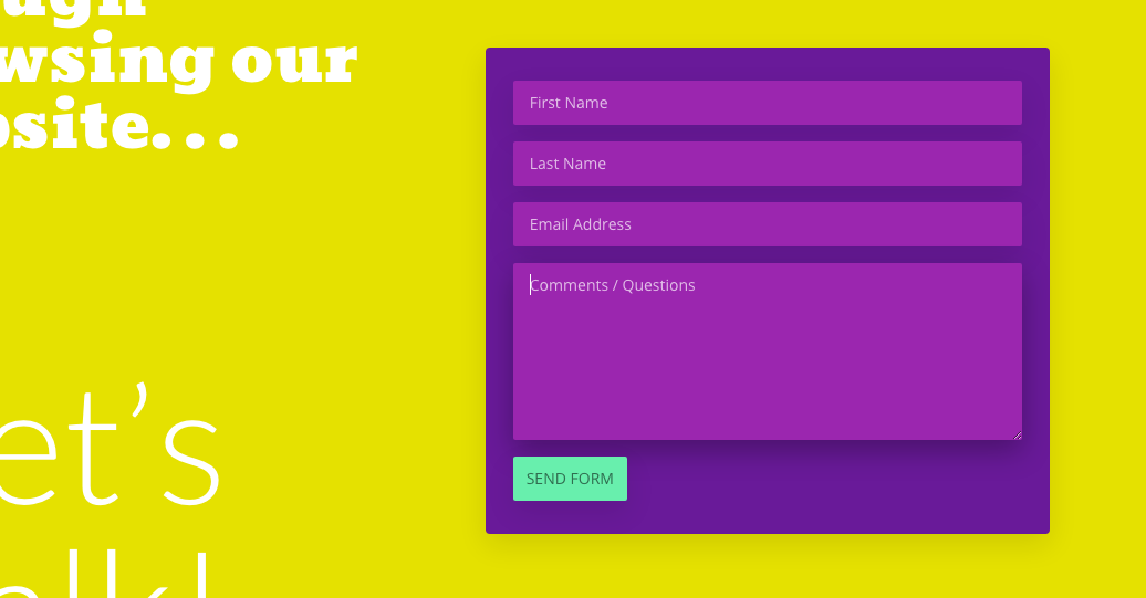
Now that we’ve just briefly touched on what just some of the characteristics of material design are let’s dive into the code. Here’s the end result of what the CSS in this post will help you achieve. I’ve tried to stay as true as possible to the Material Design principles. I even used a color palette found in their documentation.
The animation is only applied to the message box since that was really the only appropriate place for that particular style of transition. Remember, we don’t want overkill.

The following code is going to go into your child stylesheet or your WordPress Customizer > Additional CSS box or any other custom CSS box your theme may come with.
I happen to be using Divi in this example, but I didn’t write this tutorial with any specific theme in mind. What’s great is this code can be used on any WordPress theme since we are using our own built-in Caldera Forms classes instead of custom classes.
Notice that I’ve commented out what every code chunk does in case you would like to change any colors or timing or anything else.
In Conclusion
I have not worked in Material Design a lot and still have much to learn about the idiosyncrasies of it, but I love the overall aesthetic and feel. It is one of the directions web design is going towards more. Hopefully you can get some good use of our code snippets and this Caldera Forms style will enhance your website.