Landing pages need good UX to be effective. This article will show you how to accomplish that. If you’ve ever bought a car from the dealership, you know the VIP treatment comes when you’re close to making a purchase. This is a smart sales technique, and it’s effective online as well as off.
Good UX Leads To Happier And More Trusting Customers
Natalie Andersen, a UX designer at GetGoodGrade, explains why UX should be a priority.
“I work hard to help our clients create not just a frictionless experience, but an enjoyable one. The process of making a payment online requires both effort and trust. Good UX reduces the former and increases the latter.”
If you’ve decided to use WordPress for your website, here are seven tips for improving UX on your landing pages.
1. Optimize For Performance
A lot of the focus on UX design is all about what the user sees. This is important, but there are behind the scenes elements that matter just as much. You really can’t underestimate the importance of performance in UX.
Slow loading pages and poor response time are frustrating at any point. When you’re asking someone to make a purchase, set an appointment, download a product, or sign up for your mailing list, that frustration is the last thing you need.
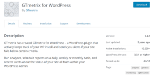
If performance is a concern, there are tools that can help. Consider the GT Metrix plugin. This tool allows you to conduct a performance audit of your entire site, including landing pages.
2. Simplify And Shorten Forms
The more information you can get from your customers, the better. It helps you to get to know them better, and you can target future marketing efforts more effectively. Of course, this has to be balanced with the user’s preferences as well.
Nobody wants to spend time filling out long forms. Think of it this way, your audience knows the information you really need, trying to collect much more than that begins to feel intrusive. It’s also irritatingly time-consuming.
To improve UX and increase the likelihood of conversions, take a look at your forms. Shorten them wherever possible. Consider restructuring them to make them even better organized if you need to.
3. Use Visuals To Enhance Aesthetics And Create Interest
Aesthetics matter. There’s a reason that luxury car dealerships and stores that sell jewelry and other luxury items are so well decorated. When something is visually appealing, people tend to stick around. Their mood improves, and they become more likely to buy something.
Further, attractive visuals create an air of professionalism. They can also, very subtly, boost your branding efforts. Choose color schemes, patterned or textured backgrounds, even background videos to enhance the look of your landing pages. Use the highest quality images that you can, and use professional photography when you are able.
4. Consider UX Writers Over Content Writers
If you simply need web content, articles, or blog posts then content writers are your best bet. If you want to improve UX, consider a UX writer. They have unique experience in writing as well as working with web design teams to create great user experiences.
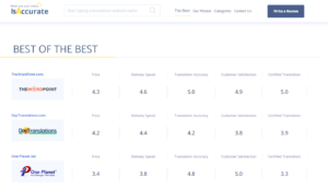
 Whether you want to hire a UX writer to be part of your team, or rely on a service provider depends on your specific needs. In either case, there are plenty of resources for you to consider. These include, Indeed, FlashEssay, Upwork, SupremeDissertations, Freelancer, or if you need to translate your UX copy into foreign language, check the reviews on best translation services on IsAccurate.
For a quick, accurate website translation, just use Caldera Forms + Weglot!
5. Display Products so Customers Can Really See Them
Showing pictures of your products is the absolute bare minimum you should be doing. Truthfully, there are so many better ways to highlight your products and give visitors a closer look.
Try embedding product videos. Let your visitors see what your products can really do. 360-degree viewing is another option for your WP landing pages. This gives your potential customers the ability to rotate product images to look at them from every possible angle.
Daniela McVicker, a UX writer at RatedByStudents says,
“There are two benefits to 360 degree viewing. The first is obvious. Customers get to see all sides of a product. In addition to that, it gives visitors something to do. As they’re spinning and rotating the objects, they are increasing time on page and other metrics.”
6. Optimize Your CTA Button
You should always consider ease of conversion when you design landing pages for UX. In spite of not taking up much space, the CTA button is an important part of your design. It should be easy to find, and visitors should know exactly what to expect when they use it.
 Amanda Sparks, a digital marketer from TopDownWriter, states,
“Clients are often surprised at the amount of time UX designers spend on the call to action button. The button text, and the surrounding text is extraordinarily important. So is button color and placement. It’s very important to make the button clear and accessible without making it intrusive.”
There are a number of very nice CTA plugins for WordPress. Many include tools for A/B testing, and conversion rate monitoring.
7. Use A Chatbot To Provide Last Minute Assistance
Ethan Dunwill, a UX Designer at HotEssayService, states,
“Even the best landing page copy can’t cover everything. You never know when a user might have a last minute question, or become a bit lost. We’ve begun using chatbots on many of our landing pages to add an extra layer of support, and couldn’t be happier with the results.”
WordPress offers a variety of chatbot plugins to try. This includes the Woowbot plugin which is compatible with WooCommerce.
Improve Conversions With Good UX
It’s really a simple concept. You’ve got someone about as close to converting as you can. Provide them with a great experience, and you will increase your chance of closing the deal.
