Over the last three years of focusing our energy on what makes a form tick, we’ve picked up many tips and tricks on how to make a contact form for WordPress. Last month, I gave a presentation on these years of learnings about forms at a conference in Tel Aviv called Press For Word. This talk seemed to resonate with many people, so this week, we’re bringing that content to you in a blog post.
At Caldera Forms, our team thinks about contact forms a lot. Some of that rumination is intentional. For example, when we think about new features, we are consciously making decisions about what a web form absolutely has to do vs. what it would be nice if it would do. We make choices about form functions that power 100,000+ websites online. We think about how users of forms interact with them, and we also think about how form creators think about their project. Sometimes, we think about how to bridge users and creators when their motivations and goals don’t match.
But most of the time, the rumination that we do on forms is completely accidental. When we support our customers, we’re exposed to all of their projects: the simple ones, the incredibly complicated ones, and everything in between.
This isn’t your basic “how to make a form in WordPress” blog post. In this post, I will give you the best tips and tricks to make a great form in WordPress, based on three years of experience.
What Makes A Great Simple Contact Form?
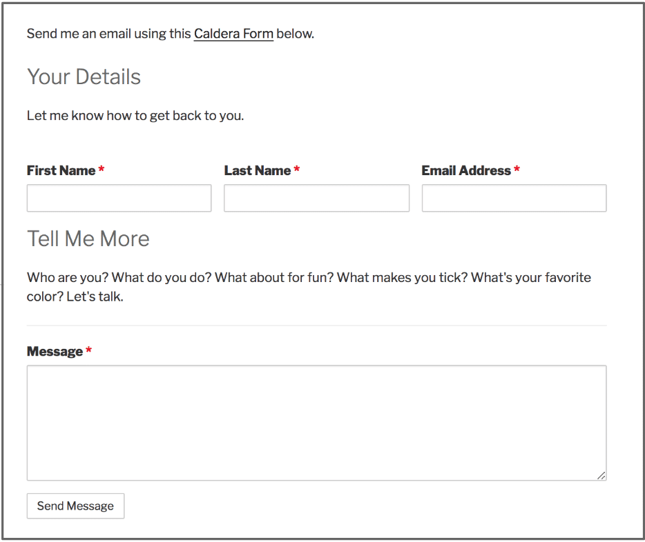
Most tutorials on how to make a contact form for WordPress tell you to install a plugin first. This tutorial will do the same: using Caldera Forms, you can get a fully functional contact form in three clicks. The video above outlines the basic process, courtesy of the folks at WinningWP. But more than being functional, this contact form is based on research about how users need to use contact form data, both when they’re small and when they get bigger.
Separating First Name And Last Name
The one thing you’ll notice about our simple contact form template is that we separate the first name and the last thing. Oftentimes, this detail is not something that people think about unless they spend all of their time thinking about what forms should do (which is what we do).
This will be an advantage when you start using your form data after you collect it, and is an important practice to begin as you start making forms. Consider the following: the first name and the last name written together are very human readable but not very computer readable. Especially in today’s global economy, we haven’t really talked computers how to differentiate between two-word names, three-word names, last name vs. first name, etc. This gets in the way when you want to send a mass email campaign and you don’t want to call everybody by their full names, lest you end up addressing everyone on your list like their angry parents.
A common support request that we get is this: how do I process my form data a certain way before getting it into a .csv? From a technology standpoint, that’s an expensive problem that could have been prevented. Good design practices are like preventative medicine: a bit of an investment upfront saves you a lot of time down the road.
Reprocessing the output of a .csv requires custom code in most cases. However, separating your first and last name fields do not. This is an example of the sort of thing most people probably never think about, but in Caldera Forms, we think about it all the time. That’s why I encourage you to use our simple contact form template as a starter. The layout and design that you see there are based on research. And if you must create a form from scratch, remember to collect different pieces of information in different fields.
What Makes A Great Complex Contact Form?
We know a lot about simple forms, but we know even more about complex forms. Caldera Forms tends to be the tool of choice for complex forms. Whether you need additional or conditional information from the people filling out your form, those types of complex forms are where Caldera Forms does particularly well, and we’ve gotten good at supporting them and making them work.
We define “advanced contact form” as a form that collects information from a user based on conditions of the user inputs themselves. Since we wanted to be the solution for advanced contact forms, the ability to live update when data is inputted by the user is the cornerstone of how Caldera Forms works.
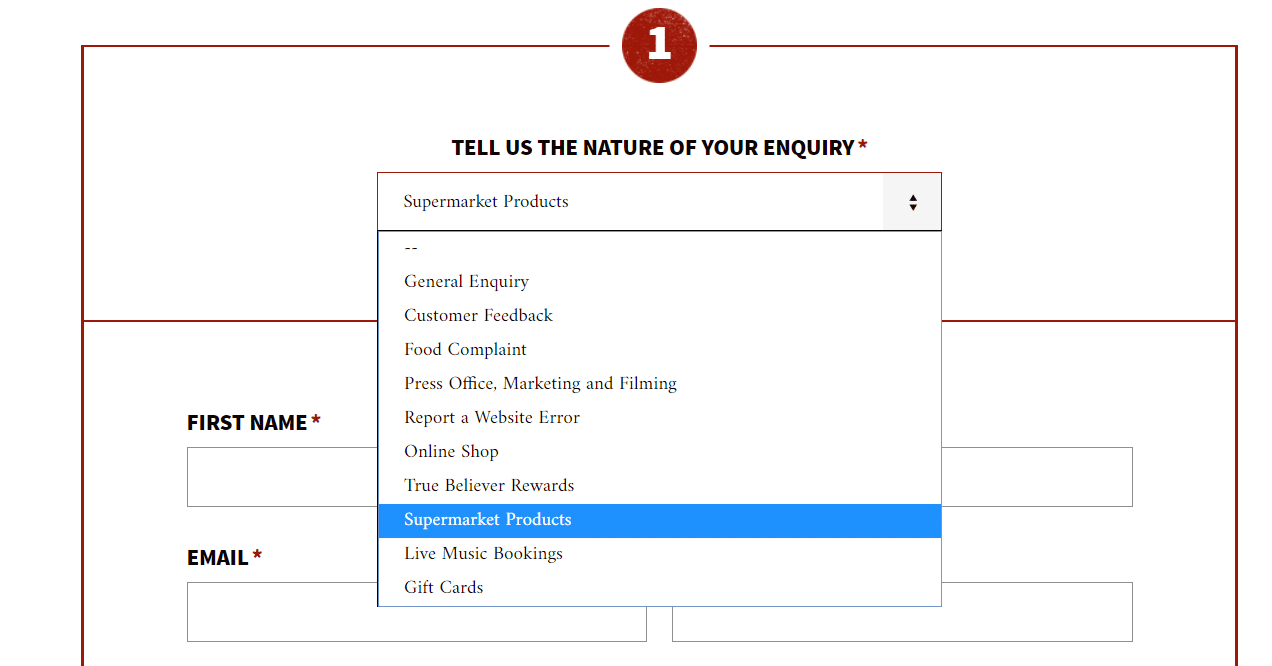
In this example, you see a contact form that has all of the same traditional fields of the simple contact form. But in addition to that, it has a drop-down select field that asks the user more about what they need. Then, depending on what they select, the form loads different fields to complete the request. One of the select options prevents submission altogether as the user is in the wrong place and needs to be redirected to the correct source of information.
Having too many leads is an excellent problem for any entrepreneur to have, however, the stress of not being able to respond to everybody, or having to sit through many irrelevant forms submissions, can be very taxing. For this reason, an advanced contact form is an excellent strategy to start pre-processing your business data before it even hits your desk.
What Makes A Great Booking Form?
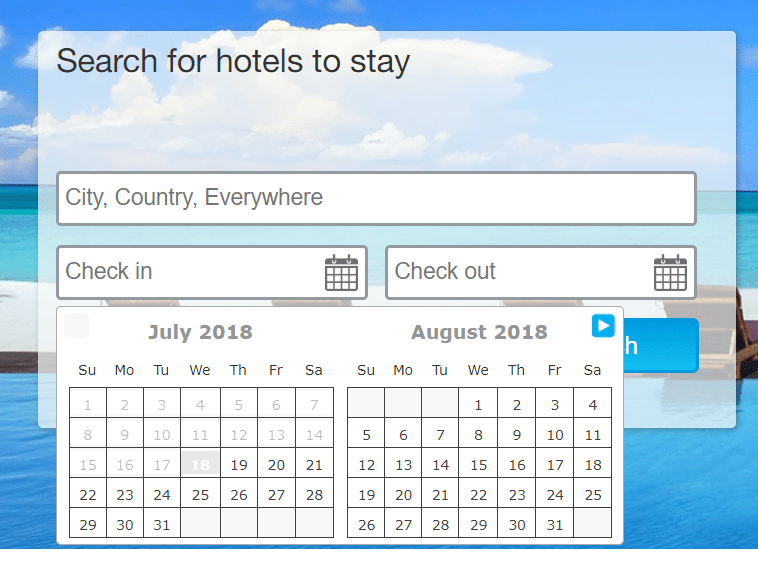
The second most common layer of complexity that we see when building forms has to do with booking dates. To understand why this is considered complex, it’s good to understand how computers understand dates vs. how humans understand dates.
Most humans, after enough time processing date information, are fairly capable of understanding the irregularities of date calculations. There are 12 months, each of those months has a different number of days, and years go backward at a certain point. However, these kinds of logic are a little bit more confusing for a computer. If you’re interested in learning more about this problem, you can check out this link, but for the purposes of this article, you just have to understand that this task is not as easy for a computer as it is for a human.
This can get complicated when date fields are thoughts of as number fields, but they are not, really. It is challenging to format dates to look like dates. It gets even more complicated when the dates are on a different month or year, as you might miscalculate.
For you as a website builder, this can be pretty frustrating. However, you can save time and money by utilizing ready-to-use solutions like Caldera Forms. If you need to collect date data, we will reconcile these problems for you.
That’ll probably sound great and straightforward. However, something that we’ve learned from talking to our customers is that out-of-the-box solution comes with a trade-off: lack of customization. If you have to use an out-of-the-box solution to get dates right, this can often mean that you can’t get your dates to look exactly how you want them to look like – whether that’s 4 digit or 2 digit numbers, written months vs. numeric months, etc. This can get complicated and frustrating, fast.
Don’t Forget To Solve Your Actual Problem
When we see requests like this, we usually ask questions like: “What is your goal?” To understand why we ask this question, first you should understand the concept of the XY problem. For many things in web development, especially form building and data collection, being aware of how XY problem develops and training yourself to always solve for x and not for y can be very useful. In fact, at Caldera Forms, it’s part of essential training for any new team member.
The XY problem is described as follows: when you’re trying to build something, you have a problem x. As you try to build your solution, you develop a new problem with your attempted solution: problem y. Now, you focus on problem y, but there’s a problem: you’re no longer solving your actual problem, you’re solving for a solution that may or may not work. While solving problem y might be useful, there’s no guarantee that it will help you solve the problem x. There could be a solution z which is easier or more affordable or good enough that could solve your problem x. You can read more about the XY problem at this link and how it originated within computer science and problem-solving circles.
So, when we are asked how do I reformat my date, we ask back, what is the problem? We want to know why you want to reformat the date. Do you want to do that because the client asked for it? Do you want to do that because it is required for the way in which the down at the form collects will be processed in the future? Depending on what the answers are, our suggestion could be different. If there is a special data collection rule, it might actually be beneficial for you to separate the preformatted date field into something that isn’t a date field but actually fulfills your goals.
When building forms, knowing how data works behind the scenes is power. But even if you don’t commit yourself to that – after all, that’s our job – training yourself to always solve for x will make you unstoppable in many aspects of life, not just form building.
What Makes A Great Registration Or Application Form?
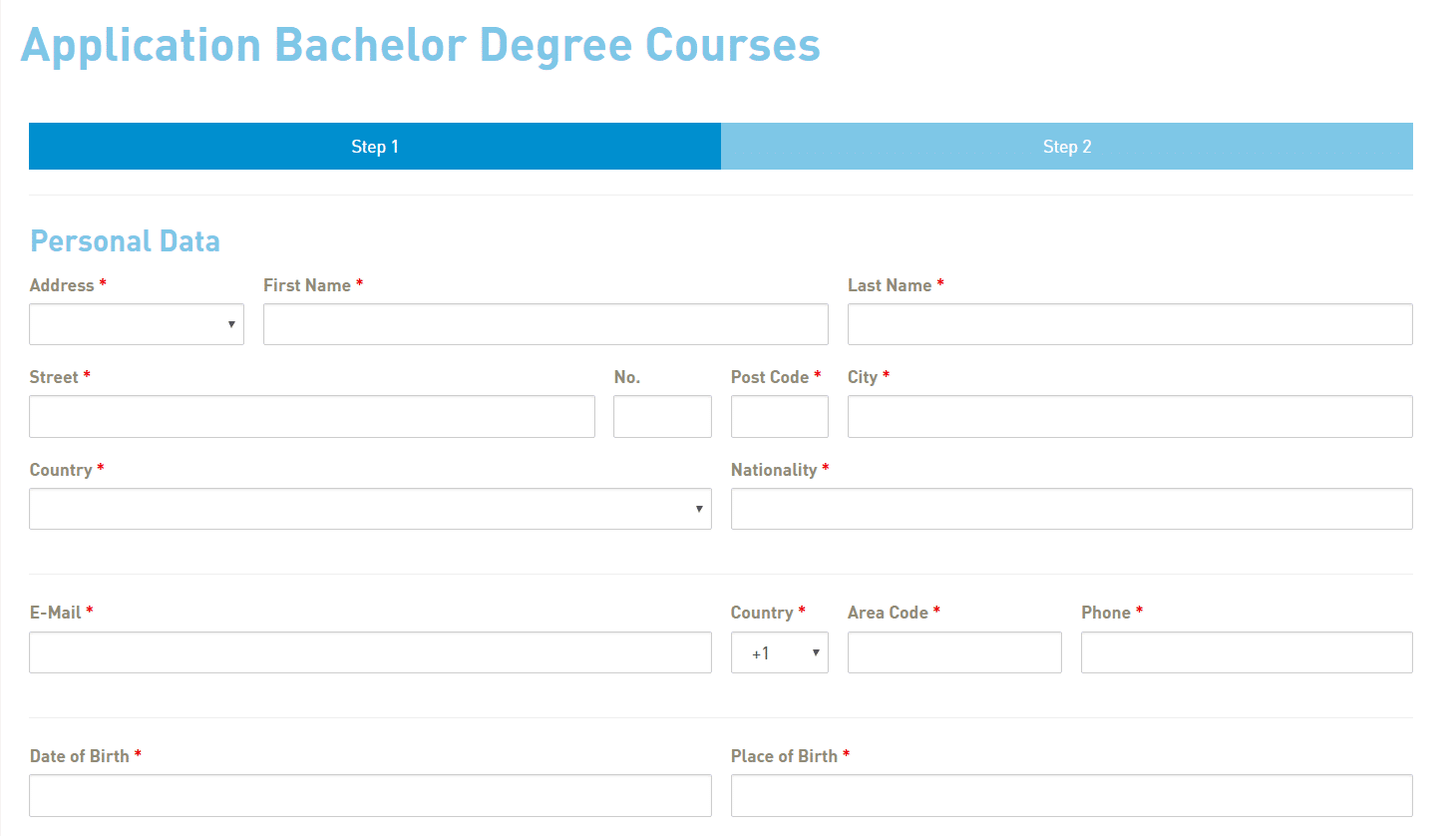
Once we start adding fields to a contact form, the possibilities are endless. A contact form can quickly turn into a registration form for an event, a ticket sale, or even an application for a college.
We encourage every site builder to come up with creative ways to collect data that streamlines business processes and makes more money for you and for your clients. Some of the ways in which we’ve seen Caldera Form used are use cases that we could never have imagined. We love seeing this kind of functionality brought to the regular consumer, not just reserved for big companies with big budgets. It’s why we do what we do.
Shorter Is Better
All of these different forms are unique and wonderful, except for one way in which they are all the same: if you make the form too long, it will be slow. From a logical standpoint, having too many fields means more things to validate at one time, more things to pre-process at one time, and more things to load display and style at one time. Hundred field forms are almost never a good idea.
They’re not a good idea for both computers and humans. We know that attention spans are getting shorter and shorter, which means that when faced with a very long form, people may not want to fill it out. This leads to loss of leads and lots of potential sales. When dealing with a very long form, it’s slow so it won’t load, but even if it did, it won’t get filled out.
In these cases, we tend to ask you the same question as above: what is your goal? What information do you really need from your users right now, and what information could be better collected by you in a follow-up call for the lead and putting the information into a system? Usually asking this question reveals that all hundred of those fields are not necessary. You’ll end up with the information needed to make the next contact is, which is likely less than 100 fields.
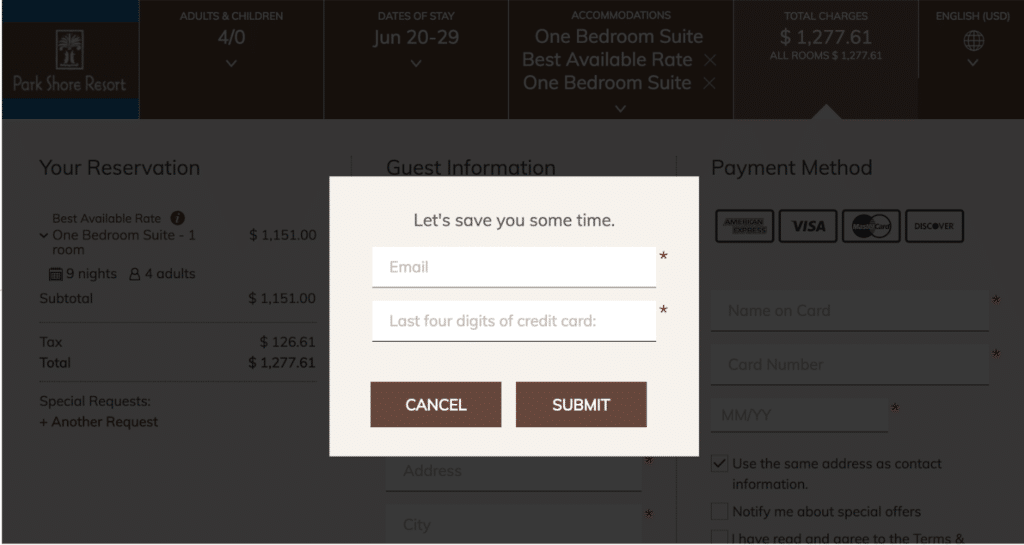
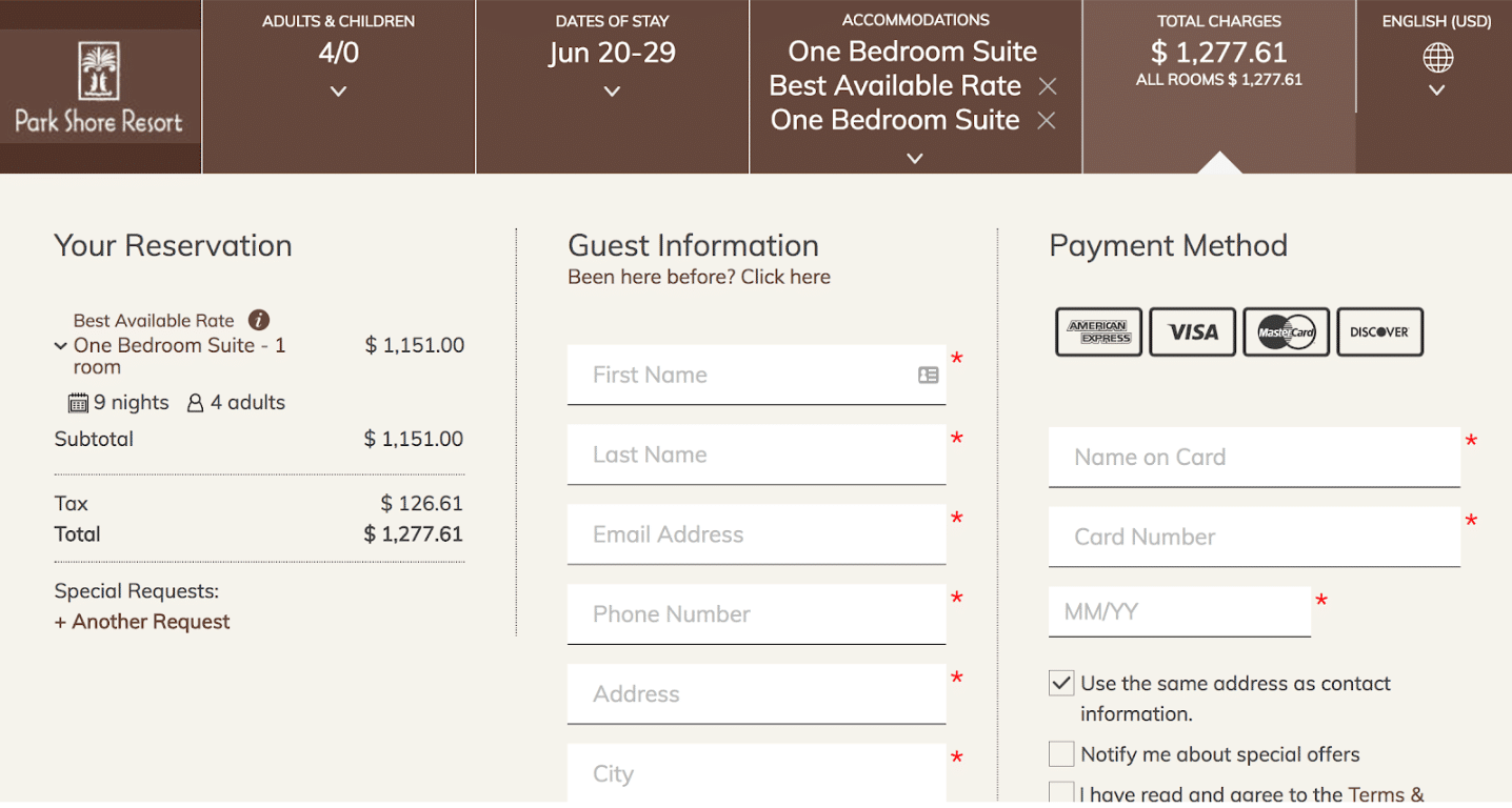
With that said, sometimes you need a lot more than simple notes to do anything. In these instances, we recommend using solid principles of design. In general, your goal is to get a person to say “yes.” People will more likely to say yes to shorter prompts rather than longer prompts. A strategy that we really like is to show the person a simple form, and then moves on to the next page with more questions.
This form is great because it gets you to say “yes” by asking for an easy piece of information – an email. There should be no barrier to giving you this – no need to find a card, no emotional hurdle of “should I be spending” or “do I want to give away my information” to overcome. Once you get a yes, subsequent yeses are supposed to be easier. Humans are committed to not “going back on what we started.” From there, you have the opportunity to ask for more information.
And, more importantly, you have contact information. Have you ever shopped somewhere online and forgotten your cart (or deliberately walked away from it because you changed your mind, or found a better deal), and a few hours later you get a message that says “Hey you, did you forget something?” This process of abandoned cart recovery is something that form creators and digital marketers have discovered works, but essential to this strategy’s success is getting the user to say “yes” to sharing contact information.
So remember: sometimes your form is undeniably complicated, but you still can use the proven strategies of user experience design to make sure that your forms convert.
How To Prevent Form Spam
Another common question that we see all the time is about form spam. Something important to understand about form spam is that because of the ubiquitous nature of WordPress, it tends to be targeted by spammers more than the average website. In fact, the average website is attacked 44 times per day. Fortunately, most of these attacks are unsophisticated, so if you are using high-quality out-of-the-box tools for your website such as a quality hosting, a security plugin, and a contact form product, these attacks will be mitigated before you even notice.
When your form gets spammed, that means spam is getting through your existing spam protections. You need to assess both the quality of your out-of-the-box spam protection and also keep a proactive mindset to website security. Those spammers and malicious actors get better every day. What worked today may not work tomorrow. However, it is also the job of the tools that you use to makes sure that they are keeping up with these developments.
The first question to ask yourself about spam is: why is this getting through? Your quality hosting provider should be mitigating most unsophisticated spammers, your up-to-date WordPress install should be adding another layer of protection, and your security products and protections within website interaction products (such as a contact form) should be catching the rest. If this isn’t happening, which product is failing? You should start at the bottom of that list, and work your way up – understanding that this is a proactive process that continues for as long as the website lives, and especially as it gets more and more popular.
Website Accessibility Basics
This is a larger topic that you should explore on its own, that is more important and overarching than forms alone, and cannot be fully covered near the end of this tutorial. However, this tutorial would be incomplete without a mention of the importance of accessibility concerns when putting web forms online.
Consider this: close to 18% of all internet users are using some sort of assistive device to access the internet, whether that is a text enlarger, a screen reader, etc. Not only that, but people are using different devices and connection qualities to access the internet. They may be using mobile devices, 2G connections, maybe both. Finally, they may be using translation tools, which may present a problem to your able viewer if you have, for example, text on images with no alt text.
Web accessibility practices that apply to your whole website also apply to forms. There are several tools that you can use to test your website’s accessibility. Check out:
Final words: accessibility shouldn’t be an afterthought, it should be a priority of your web development process and therefore your form building process.
Know Your Audience
Hopefully, this article summarizes 3 years of obsessing over forms in a way that relates to you, the reader, some of the things we think about day in and day out.
However, in my opinion, the most important lesson of all is this: know your audience. Some audiences respond better to certain practices than others, and it is up to you, the website owner, to make sure that you identify the meeting points between what research about web forms and design says and what the users of your particular market need.
Stay open-minded and inquisitive, and you will succeed at making great forms (and great sites)!

2 thoughts on “What Makes A Great Contact Form? (Based On 3 Years Of Experience)”